UX Project

Lune Cafe

A vibrant cafe concept offering handcrafted drinks, viral desserts, and feel-good experiences through modern locations, online ordering, and community-focused service.

ux researchproduct designlunecafewebsiteuwseattle
Timeline10-week project
ProjectHCDE 537
My RoleUX Research, IA, UI Design, Prototyping, Usability Test
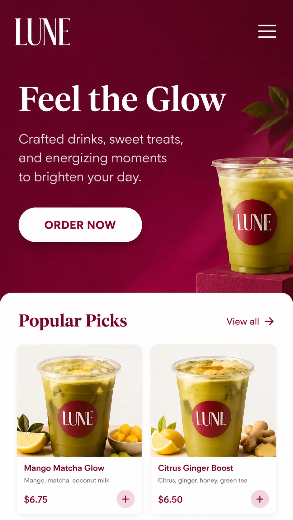
Demo screen one
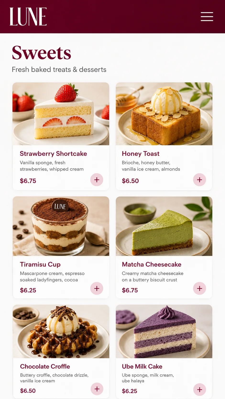
Demo screen two

The Problem

Our research and evaluation revealed key issues blocking users and impacting the business.

Hard to Find Information

63% of survey participants said key information like locations, hours, and amenities was difficult to find.

Unclear Product Details

58% wanted more details about ingredients, customization, and pricing before ordering.

Navigation Issues

Broken links, hidden actions, and poor structure made navigation difficult.

Rewards Confusion

Users didn’t understand how the rewards system worked or where to access it.

Research

We used multiple methods to understand users, validate problems, and inform our design decisions.

Google Review Analysis

Analyzed 50+ reviews to understand customer sentiment and pain points.

Heuristic Evaluation

Evaluated the current website against 10 usability heuristics and found 7 critical usability issues.

Survey

Collected 17 responses from real customers about their experience and needs.

Usability Testing

Tested 4 participants completing 5 core tasks on the existing and redesigned prototype.

Card Sorting

Conducted open card sort with 9 participants to create an intuitive information structure.

Key Insight

Users need a seamless experience with clear navigation, detailed product information, and a trustworthy ordering process.

Personas

We synthesized our research into two primary user types that guided our decisions.

Tara Rodriguez

Tara Rodriguez

Online Customer

Goals
• Order quickly and confidently
• Find clear menu and pricing
• Customize orders easily

Frustrations
• Unclear menu details
• Confusing customization
• Too many steps in checkout
• Risk of wrong location

Daniel Park

Daniel Park

Information Seeker

Goals
• Learn about Lune Cafe
• Compare locations
• Understand atmosphere

Frustrations
• Hard to find location info
• Limited photos and details
• Navigation is unclear

Insights to Design

We turned user insights into guiding principles and specific design decisions.

Insights

• Users want confidence before ordering.
• Information is hard to find and not well organized.
• Platform switch to Toast creates friction and distrust.
• Users think in terms of tasks, not company departments.

Design Principles

• Support confident decision-making
• Reduce friction across the ordering journey
• Make key actions easy to find
• Organize around user tasks

Design Decisions

• Add detailed product info, ingredients, and pricing
• Simplify navigation and surface core tasks
• Improve visual consistency and maintain brand identity
• Give users transparency and control throughout ordering

How We Measured

• Usability testing task success rate & time on task
• User feedback and satisfaction
• Comparison to previous site, qualitative & quantitative

Key Improvements

Every change we made was intentional and connected to a specific problem and business impact.

What We Changed

• Built a seamless ordering experience
• Simplified navigation & IA
• Added detailed product information
• Redesigned rewards experience
• Made events more visible
• Improved visual design & mobile UX

Why We Changed It

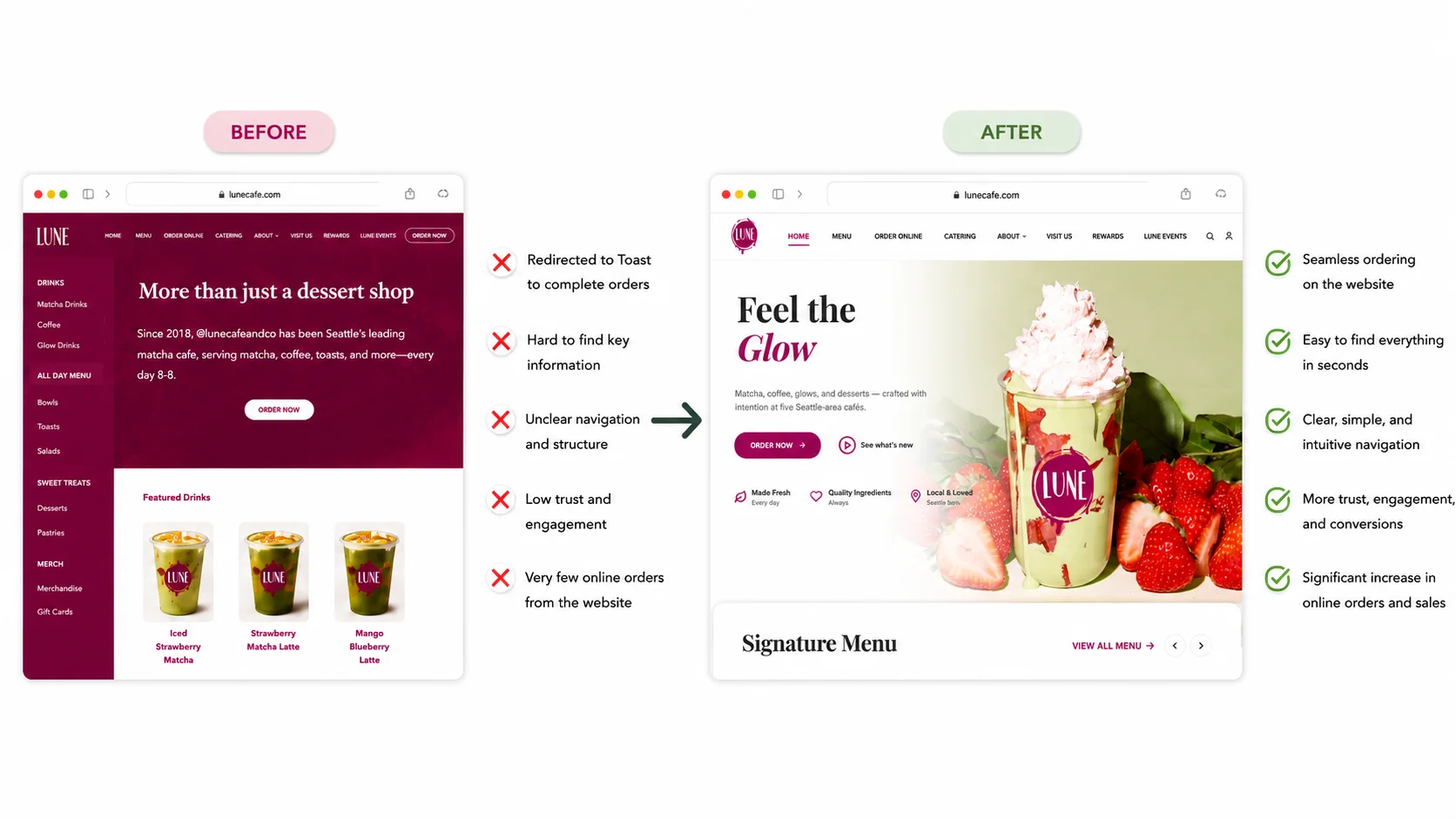
• Users were confused by the redirect to Toast.
• Users couldn’t find key info or complete tasks.
• Users wanted more details before ordering.
• The rewards system was unclear and hidden.
• Events were buried and hard to discover.
• Site felt outdated and wasn’t mobile-friendly.

Impacts

• Increased online orders and reduced drop-offs.
• Users find what they need faster and easier.
• More confident decisions and higher conversion.
• More sign-ups and repeat customer engagement.
• Higher event discovery and ticket sales.
• Stronger brand perception and usability.

Information Architecture

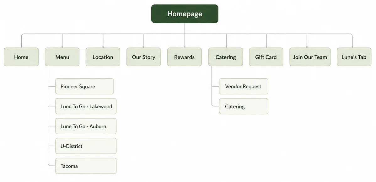
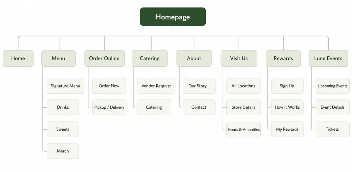
We organized the content around what users want to do and simplified the navigation.

Before (Original IA)

Before (Original IA)

After (Redesigned IA)

After (Redesigned IA)

Testing

We tested, learned and improved.

What Worked Well

✅ Clear navigation and structure
✅ Detailed product information
✅ Easier location discovery
✅ Seamless ordering flow
✅ Clean and modern visual design

What Didn’t Work

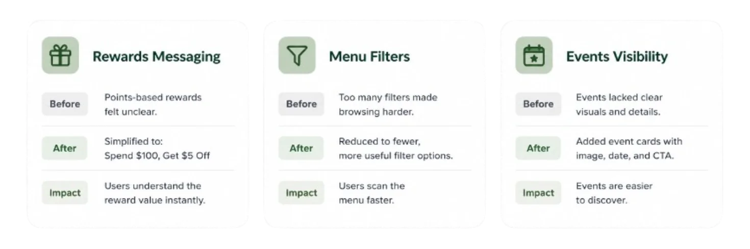
❌ Rewards value still unclear
❌ Too many filter options in menu
❌ Need more event visuals
❌ Some confusion with Toast redirect messaging

Key Iterations

We refined the design based on usability testing feedback.

Final Outcome

We didn’t just redesign a website. we removed barriers that were holding the business back. Now, Lune Cafe has a digital experience that supports growth, delights users, and builds lasting loyalty.